| Author |
Message |
z-i-p-p-y
Lieutenant Commander

Joined: 23 Jul 2004
Posts: 276
Location: England.... that place that looks like a kangaroo
|
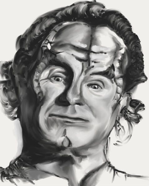
 Tue Jul 22, 2008 12:55 pm Phlox Tue Jul 22, 2008 12:55 pm Phlox |
|

if you click here it will take you to a larger version.
Anyone for a bit of critique?
There is just something that doesn't work here. Are his eyes off? Cheeks?
I think I've been staring at it too long. What do you think that doesn't make seance?
Edit: This is so impressive, I decided to sticky it for a while -Lord Borg
Last edited by z-i-p-p-y on Tue Jul 22, 2008 1:35 pm; edited 1 time in total
|
|
|
AUDACIOUS
Commander

Joined: 06 Jul 2005
Posts: 491
Location: scifivisions.com
|
 Tue Jul 22, 2008 1:31 pm Tue Jul 22, 2008 1:31 pm |
|
Holy cow! 
stunning work, Zips!
But when I click on the picture it doesn't take me to the larger one. 
|
|
|
z-i-p-p-y
Lieutenant Commander

Joined: 23 Jul 2004
Posts: 276
Location: England.... that place that looks like a kangaroo
|
 Tue Jul 22, 2008 1:36 pm Tue Jul 22, 2008 1:36 pm |
|
Humm you can't hyper link images here... oh well...
gah his neck looks all off now and the right of his face looks to big
|
|
|
Curtis
Fleet Admiral

Joined: 29 Sep 2001
Posts: 14903
Location: Wisconsin
|
 Tue Jul 22, 2008 10:57 pm Tue Jul 22, 2008 10:57 pm |
|
very nice z-i-p-p-y...im not much of a critic so cant help you there, but in all honesty i think it looks perfectly brilliant  ! !
|
|
|
robbiewebster
Rear Admiral

Joined: 27 Apr 2004
Posts: 2594
Location: Rochester, New York
|
 Wed Jul 23, 2008 5:11 pm Wed Jul 23, 2008 5:11 pm |
|
| z-i-p-p-y wrote: | Humm you can't hyper link images here... oh well...
gah his neck looks all off now and the right of his face looks to big |
It looks great. I love it.
|
|
|
z-i-p-p-y
Lieutenant Commander

Joined: 23 Jul 2004
Posts: 276
Location: England.... that place that looks like a kangaroo
|
 Tue Jul 29, 2008 5:01 am Tue Jul 29, 2008 5:01 am |
|
Humm Right I think I am going to sort out the neck
I think i want to do his eyes more like the contact lens, they're amazing
|
|
|
calvin
Lieutenant, Junior Grade

Joined: 31 Jul 2008
Posts: 78
Location: SoCal
|
 Mon Aug 11, 2008 8:58 am Mon Aug 11, 2008 8:58 am |
|
even though i don't know who Phlox is, i have to say, that's a very fine drawing. what did you draw it with? is it digital or real media? it's hard for me to tell these days.
my critique:
as far as human anatomic proportions, i don't know how much it applies in this case, but it looks pretty spot on in general. what i did notice is that the medial lines running down the center of the face don't seem perfectly aligned.
that's about the only thing that's somewhat conspicuous about the drawing. it's clear that you've had some kind of formal training or _lots_ of practice. did you draw guidelines (medial axis/center of gravity, brow line, eye line, etc.) before you started to sketch the details?
and i know exactly what you mean by "staring at a picture too long." sometimes it's helpful to take a few steps back and look at the picture from a greater distance to "reset" your focus and pick out inaccuracies--and there will always be something that's still off.
i think the difference between a good artist and a great artist is patience. great artists are perfectionists and will keep tweaking their drawings until there is absolutely nothing more they can do. this process may take 10 or 20 hours for a single piece. a good artist may give up after just 4-5 hours.
you've obviously got a very well trained eye, and a good sense of proportions. i think this composition is particularly tricky simply because his head is tilted to the right, making it easy to skew things.
|
|
|
Lord Borg
Fleet Admiral

Joined: 27 May 2003
Posts: 11214
Location: Vulcan Capital City, Vulcan
|
 Thu Aug 21, 2008 11:05 pm Thu Aug 21, 2008 11:05 pm |
|
What sort of source did you use for this drawing? Your memory of what he looks like, or a screenshot/promo image? Just curious. It looks pretty good to me, if your looking for crits, depending on what you intend behind this image, he looks as if something could be troubling him...but then again, I might read to much into this  In all honesty though, this is a great drawing, I bet John Billingsley would get a kick out of this. Maybe its the shadowing, but the...(trying to decide which side its called from this view)...left? Right? IDK, the one on this < side of the image, the eybrow I mean, looks like its not there? Perhaps adjustment on the smile line, or whatever its called... again this < side looks more pronounced then the other, then again, it might be the intention of this image to have that side closer to view then the other? In all honesty though, this is a great drawing, I bet John Billingsley would get a kick out of this. Maybe its the shadowing, but the...(trying to decide which side its called from this view)...left? Right? IDK, the one on this < side of the image, the eybrow I mean, looks like its not there? Perhaps adjustment on the smile line, or whatever its called... again this < side looks more pronounced then the other, then again, it might be the intention of this image to have that side closer to view then the other?
Still, great drawing, keep up the good work.
-------signature-------
When you cried I'd wipe away all of your tears
When you'd scream I'd fight away all of your fears
And I held your hand through all of these years
But you still have
All of me
|
|
|
|
|
You cannot post new topics in this forum
You cannot reply to topics in this forum
You cannot edit your posts in this forum
You cannot delete your posts in this forum
You cannot vote in polls in this forum
|
Powered by phpBB © 2001, 2002 phpBB Group
Star Trek �, in all its various forms, are trademarks & copyrights of Paramount Pictures
This site has no official connection with Star Trek or Paramount Pictures
Site content/Site design elements owned by Morphy and is meant to only be an archive/Tribute to STV.com
|


